Hmm...

Discuss application theming and theme development.
User avatar
Frank Lion
Posts: 21177
Joined: April 23rd, 2004, 6:59 pm
Location: ... The Exorcist....United Kingdom
Contact:

Hmm...

Post by Frank Lion »

Hi, I'm Frank ...hope that wasn't their best shot.


Image


Image


Glad that's done, now time to hit the town :)

http://www.youtube.com/watch?v=N7gqErYW0K0
"The only thing necessary for the triumph of evil, is for good men to do nothing." - Edmund Burke (attrib.)
.
User avatar
patrickjdempsey
Posts: 23686
Joined: October 23rd, 2008, 11:43 am
Location: Asheville NC
Contact:

Re: Hmm...

Post by patrickjdempsey »

Did you fix that crummy FindBar while you were at it Frank? ;)
Tip of the day: If it has "toolbar" in the name, it's crap.
What my avatar is about: https://addons.mozilla.org/en-US/seamonkey/addon/sea-fox/
User avatar
Frank Lion
Posts: 21177
Joined: April 23rd, 2004, 6:59 pm
Location: ... The Exorcist....United Kingdom
Contact:

Re: Hmm...

Post by Frank Lion »

patrickjdempsey wrote:Did you fix that crummy FindBar while you were at it Frank? ;)

Only a quick restyle. Although I know how to fix it, it's not worth fixing. The Firefox Findbar is, and always has been, utter crap. The extension SearchWP is a 1000x better - highlighting all words in different colours across all tabs, etc, etc. It really is a very powerful extension and the author does himself no favours by not explaining on AMO all of its features.

Now that everything is functioning as it should, I'll take time to consider what the new icons should look like and when done, just code the default one out and slip my new one in and so on.

For example, what should an Options icon or Addon icon look like and how will each blend in with the rest of my set on that theme? Because of the time they take to make, good icons are like puppies - 'Not just for Christmas, but for life' ...so it pays to consider them at a more leisurely pace (well, certainly a lot slower than the piano player pace that I code at :) )


Word up, devs. Not looking like ******* Chrome now, is it? :P
"The only thing necessary for the triumph of evil, is for good men to do nothing." - Edmund Burke (attrib.)
.
User avatar
patrickjdempsey
Posts: 23686
Joined: October 23rd, 2008, 11:43 am
Location: Asheville NC
Contact:

Re: Hmm...

Post by patrickjdempsey »

I spent about an hour today coding up a binding that "fixes" the Findbar... at least gets it back to it's mostly-harmless former state. But you are right, it's also mostly-useless. While I was at it I made sure the Highlight All button is on by default. I will happily share it, but as it requires custom localized strings, it's more extension than theme territory.
Tip of the day: If it has "toolbar" in the name, it's crap.
What my avatar is about: https://addons.mozilla.org/en-US/seamonkey/addon/sea-fox/
User avatar
CatThief
Posts: 1854
Joined: January 19th, 2004, 12:19 am
Location: Northeast USA

Re: Hmm...

Post by CatThief »

Frank Lion wrote:Hi, I'm Frank ...hope that wasn't their best shot.


Image

Good Lord I have to ask... what is that? I haven't delved into Firefox for so long I'm not even close to recognizing it. It looks like Customize Toolbar inside a tab but truly I can't tell for sure. :shock:
Still passionate for Mozilla themes and extensions, just not actively developing them for public release anymore.
User avatar
patrickjdempsey
Posts: 23686
Joined: October 23rd, 2008, 11:43 am
Location: Asheville NC
Contact:

Re: Hmm...

Post by patrickjdempsey »

It's actually much worse... they do some kind of "browser within a browser" thing during Customize, and there's also a menu popup panel that becomes a flat part of the tab interface, so it's multiple paradigms at once, and none of it is very obvious.
Tip of the day: If it has "toolbar" in the name, it's crap.
What my avatar is about: https://addons.mozilla.org/en-US/seamonkey/addon/sea-fox/
User avatar
CatThief
Posts: 1854
Joined: January 19th, 2004, 12:19 am
Location: Northeast USA

Re: Hmm...

Post by CatThief »

patrickjdempsey wrote:It's actually much worse... they do some kind of "browser within a browser" thing during Customize, and there's also a menu popup panel that becomes a flat part of the tab interface, so it's multiple paradigms at once, and none of it is very obvious.

Ugh, if that's a part of Toolkit code I guess I can half expect it to land in SeaMonkey. (I'll be checking the nightlies with one eye closed.) I'm guessing this is a headache to theme. How is it that the devs continually come up with these bright ideas. :|
Still passionate for Mozilla themes and extensions, just not actively developing them for public release anymore.
User avatar
patrickjdempsey
Posts: 23686
Joined: October 23rd, 2008, 11:43 am
Location: Asheville NC
Contact:

Re: Hmm...

Post by patrickjdempsey »

Philip Chee said awhile back that he thought it wouldn't effect SeaMonkey. :D
Tip of the day: If it has "toolbar" in the name, it's crap.
What my avatar is about: https://addons.mozilla.org/en-US/seamonkey/addon/sea-fox/
User avatar
Frank Lion
Posts: 21177
Joined: April 23rd, 2004, 6:59 pm
Location: ... The Exorcist....United Kingdom
Contact:

Re: Hmm...

Post by Frank Lion »

CatThief wrote:Good Lord I have to ask... what is that?

I was forgetting many people haven't seen Australis at all. Could be worse, this is the same layout in default -


Image


In that pic, you have the empty menubar showing, so it looks slightly better in normal use -


Image


When I fired Australis up this Monday/Tuesday gone, I noticed that there was no menu once the menubar was hidden. Looked around, nope, no menus anywhere so installed my Compact Menu 3 to put on the navbar.

It was only later when I put the DOMi on it, that I realised that what I thought was supposed to be a mini customise window was actually the menu! That 3 line thing on the right is tooltipped as 'Customize and Control Nightly', but it didn't ring a bell that would be the menu itself.

What else to tell you? Oh, I forgot to do my border stuff on #customization-panelWrapper > .panel-arrowcontent (you can actually see the arrow waiting for it in the top right) but after coding my toolbarbuttons.css for this stuff (which was pretty complicated)...I forgot.

The Bookmark and History buttons you see on the Bookmark Bar toggle the sidebar and are actually custom button that I quickly coded to do this (1 line of code in each!) and use the normal state images of my existing Bookmark and History buttons. Why? well, because the Australis people have removed the existing Bookmark/History Sidebar buttons completely, that's why. :)

Later on today, I'll post some pics of BMV on my 17esr and then on Australis to show how close (or not) I've managed to maintain the look and a few notes about some of the coding bits and pieces.

Pay no attention to my second pic in the OP, that's not how I have my UI layout, that's just a shot when I was still working on this stuff.
"The only thing necessary for the triumph of evil, is for good men to do nothing." - Edmund Burke (attrib.)
.
User avatar
LIMPET235
Moderator
Posts: 39955
Joined: October 19th, 2007, 1:53 am
Location: The South Coast of N.S.W. Oz.

Re: Hmm...

Post by LIMPET235 »

Oh crap!
What an absolute monstrosity to look forward to.
YUK!
I think I'll stick with 20/23 or 24.
[Ancient Amateur Astronomer.]
Win-10-H/64 bit/500G SSD/16 Gig Ram/450Watt PSU/350WattUPS/Firefox-115.0.2/T-bird-115.3.2./SnagIt-v10.0.1/MWP-7.12.125.

(Always choose the "Custom" Install.)
User avatar
Frank Lion
Posts: 21177
Joined: April 23rd, 2004, 6:59 pm
Location: ... The Exorcist....United Kingdom
Contact:

Re: Hmm...

Post by Frank Lion »

LIMPET235 wrote:Oh crap!
What an absolute monstrosity to look forward to.
YUK!

Well, you don't have to use my BMV and I did do my best. :P


I realise I'm breaking the page layout for many of you with these fullsize images...but...

#1. Thumbnails tell you nothing.

#2. Shrinking the browser down to 500px wide before you take the pic, tells you nothing because that's not how people actually have their browser windows and anyway, the 'reduced width image trick' is an old graphics trick of how to make poor stuff look slightly better and I just won't go down that road.

However, this in userContent.css (or Stylish) will stop your page breaking -

Code: Select all

 /*.......Frank Resize wide post pages - put in userContent.css.........*/
  div.postbody {
   max-width: 650px;
    overflow: auto !important; }


...or, I can break all the image links, if this stuff really is a big problem for everyone.
"The only thing necessary for the triumph of evil, is for good men to do nothing." - Edmund Burke (attrib.)
.
User avatar
LIMPET235
Moderator
Posts: 39955
Joined: October 19th, 2007, 1:53 am
Location: The South Coast of N.S.W. Oz.

Re: Hmm...

Post by LIMPET235 »

I think you know I meant the "original default" version & not your's, Frank. Image
[Ancient Amateur Astronomer.]
Win-10-H/64 bit/500G SSD/16 Gig Ram/450Watt PSU/350WattUPS/Firefox-115.0.2/T-bird-115.3.2./SnagIt-v10.0.1/MWP-7.12.125.

(Always choose the "Custom" Install.)
User avatar
Frank Lion
Posts: 21177
Joined: April 23rd, 2004, 6:59 pm
Location: ... The Exorcist....United Kingdom
Contact:

Re: Hmm...

Post by Frank Lion »

LIMPET235 wrote:I think you know I meant the "original default" version & not your's, Frank. Image

I knew. :)
"The only thing necessary for the triumph of evil, is for good men to do nothing." - Edmund Burke (attrib.)
.
User avatar
WaltS48
Posts: 5141
Joined: May 7th, 2010, 9:38 am
Location: Pennsylvania, USA

Re: Hmm...

Post by WaltS48 »

Could somebody re-size the images so they don't break the page or not?

Thanks!

Nice theme!
Linux Desktop - AMD Athlon(tm) II X3 455 3.3GHz | 8.0GB RAM | GeForce GT 630
Windows Notebook - AMD A8 7410 2.2GHz | 6.0GB RAM | AMD Radeon R5
User avatar
Frank Lion
Posts: 21177
Joined: April 23rd, 2004, 6:59 pm
Location: ... The Exorcist....United Kingdom
Contact:

Re: Hmm...

Post by Frank Lion »

WLS wrote:Could somebody re-size the images so they don't break the page or not?

Probably not. This is a thread for Complete Theme devs in the Theme Forum and all the guys that this thread is for already know how to toggle off images or stop page breaking.

Nice theme!

Thanks.

I'll come back to that 17esr to Australis comparison stuff another time, but meanwhile here's how my stuff usually looks on Firefox17/24esr, etc (yep, I often use other themes of mine. BMV just happens to be my code template theme, so I code that one up first)

Hopefully, fellow themers are getting the message that Australis (or anything in life, really) is nothing to be afraid of. It can be done and done quickly. Anyway, I miss those 'live theming' times when Lynchie was around. So, we see and learn a bit together.

Onwards...more polish on the Australis Customise window -


Image


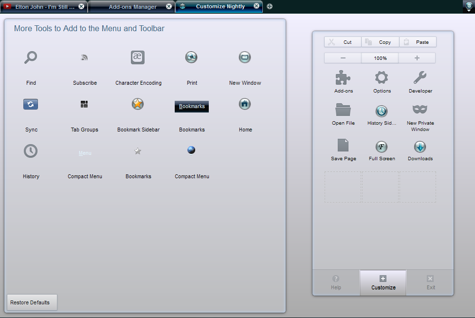
That background and box-shadow are now in on the #customization-panelWrapper > .panel-arrowcontent, but I decided to drop that .panel-arrow[side="top"] there, as it didn't make sense. Once in Customise mode that right hand side is just another drag/drop part of the whole thing, not a dropdown. I did put a big margin on it though to indicate that it is the 'menu'...that is now in customise mode. I also margined up the #customization-header.

Good thing using the default button images at this stage for ones not yet in your set. There are buttons I've never heard of and don't show up ( #tabview-button, #webrtc-status-button, #social-share-button, etc WTF?) but when they do eventually reveal themselves then you won't get the 'here's my entire toolbar.png' syndrome happening.

Couple of things to note. Without touching anything the right hand stuff drops to 2 columns, not 3, as in default. No idea why that should be, but it's fixed like this -

Code: Select all

#PanelUI-contents {
  display: block;
  flex: auto;
  margin-left: auto;
  margin-right: auto;
  max-width: 22em;/*was 21*/
}

#PanelUI-contents-scroller {
  overflow-y: auto;
  overflow-x: hidden;
  width: 22em;/*was 21*/
  padding-left: 5px;
  padding-right: 5px;
  flex: auto;


The other thing is that your own buttons get enlarged in Customise mode and look crap (whatever mode, I'm not having my stuff looking crap :)) The fix is simple (see the commented out lines) and I was actually expecting the default theme ones to shrink to their actual tiny selves (like I care) but that didn't happen -

Code: Select all

.panel-customization-placeholder-child > .toolbarbutton-icon,
#bookmarks-menu-button[cui-areatype="menu-panel"] > .toolbarbutton-menubutton-button > .toolbarbutton-icon,
toolbarbutton[cui-areatype="menu-panel"] > .toolbarbutton-icon,
toolbaritem[cui-areatype="menu-panel"] > toolbarbutton > .toolbarbutton-icon,
toolbarpaletteitem[place="palette"] > #bookmarks-menu-button > .toolbarbutton-menubutton-button > .toolbarbutton-icon,
toolbarpaletteitem[place="palette"] > toolbarbutton > .toolbarbutton-icon,
toolbarpaletteitem[place="palette"] > toolbaritem > toolbarbutton > .toolbarbutton-icon {
/*  min-width: calc(8em / 3);
  min-height: calc(8em / 3);*/
  margin: calc(5em / 12);
}


Incidentally, do not be tempted to delete any default theme coding (no matter how painful it is to look at) just comment it out. Even when you change, say, a background, comment theirs out and slap yours in. This stuff is going to change and if you've delete 70% of their code, then you'll never be able to follow the logic trail of the changes.

Since I've now had a few day's break from this (don't forget, Australis only came out 6 days ago, last Monday) I can begin to see how many of my new icons will look -

#1. I've already got miles better existing images for 'Addons', 'New Private Window', 'Find' and 'Options' so will use those - I'm not adding this stuff to my toolbar.png, I'll use my blank button 4 state (normal, hover, active, disabled) background, slap them on there and have them as standalones and code call them from where they'll live (toolbar folder?) - makes doing the -moz-image-region calculations far easier for one thing!

#2. Character Encoding (WTF?) will be done the same as I did the Fullscreen button ( yeah, you can see I spent a lot of time on that one :P) and I'll just do M. Corsiva 'ae' and throw it onto the 4 button blank button, as above.

#3. History Menu Button - copy out my existing 4 part History Button out of toolbar.png, flip it, so it shows 8 o' clock, not 4 o' clock. Job done.

#4. Bookmark Menu Button - well I've already done that one and made it look and work like the bookmark star that was in the urlbar. You can see it in the 2nd pic of the OP to the right of the Reload/Stop buttons.

#5, The others I'll come back to, but I'm sure even now that I can dream up something better than a damn spanner for 'Developer'. As always, 'Really, how hard can it be?'

So....there we go for now. As always, relax, think of it like a game of chess, put the radio on, but above all, enjoy it. :)

@ Patrick - default tabs have a 180px max, if you increase to (my usual) 250px, then tab animation breaks. Gaps just remain when you close a tab. I backed out my change and haven't investigated this since. Any ideas on this one?
"The only thing necessary for the triumph of evil, is for good men to do nothing." - Edmund Burke (attrib.)
.
Post Reply