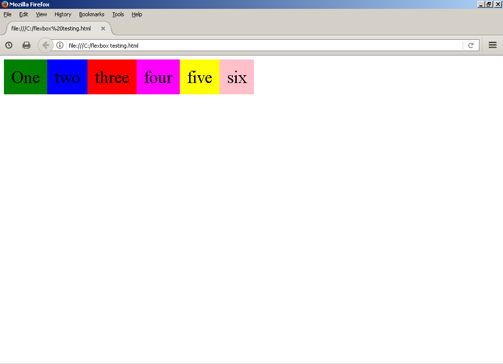
Ok so I just ran in to some weirdness with flex box that I don’t understand and I was wondering if anyone could clarify, ok so say I have the following mark up.
Code: Select all
<!doctype html>
<html>
<style>
.box1{background:green;}
.box2{background:blue;}
.box3{background:red;}
.box4{background:magenta;}
.box5{background:yellow;}
.box6{background:pink;}

.container
{
display:flex
}

.container div
{
font-size:35px;
padding:15px;
}

</style>

<body>

<div class = "container">
  <div class = "box1">One</div>
  <div class = "box2">two</div>
  <div class = "box3">three</div>
  <div class = "box4">four</div>
  <div class = "box5">five</div>
  <div class = "box6">six</div>
</div>

</body>
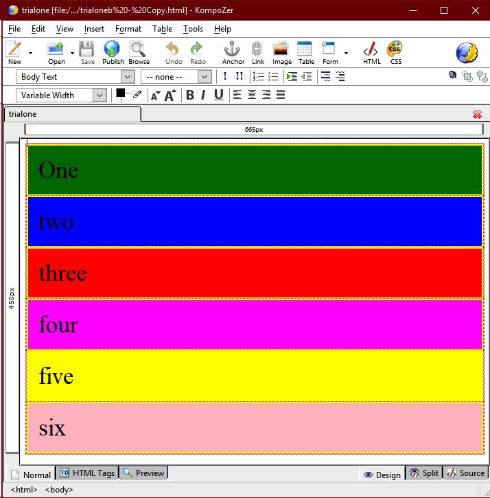
</html>Shouldn’t block level elements in a block level flex box be stacked vertically by default since block level element are already 100% of there parents width, and therefore it shouldn’t be possible for them to end up displayed horizontally on a single line by default, that should only happen if I set some additional properties.
Intuitively you would assume that if the default display was set to display block level flex items horizontally on a single line they would still be 100% of there parents width and they would simply overflow there parent container, yet this isn’t what happens instead they are made smaller so they can all fit on a single line which as far as I'm aware should only happen if you set display:inline-flex
So what is going on here why does display:flex appear to be rendering block level flex items incorrectly.
