[Ext] Glasser 3.5.2 - Add Vista Glass to Firefox 3.5 and 3.6
-
ViperAFK
- Posts: 65
- Joined: November 30th, 2005, 3:28 pm
Kupfel wrote:in case anyone's interested.. I made a style that goes with Glasser and redesigns some buttons etc. to integrate even better with the Vista GUI. It changes:
- back & forward buttons and their dropmarker
- the urlbar dropmarker
- the reload button
- the stop button
- all throbbers (nav-bar, addon-sidebar etc.)
http://userstyles.org/styles/7359

OMG I love you
-
sauronreaver
- Posts: 6
- Joined: April 26th, 2008, 1:08 am
-
SleepyPrince
- Posts: 4
- Joined: August 11th, 2006, 10:54 am
-
penguin22
- Posts: 4
- Joined: March 18th, 2005, 9:42 am
- Location: New Jersey
- Contact:
Kupfel wrote:in case anyone's interested.. I made a style that goes with Glasser and redesigns some buttons etc. to integrate even better with the Vista GUI. It changes:
- back & forward buttons and their dropmarker
- the urlbar dropmarker
- the reload button
- the stop button
- all throbbers (nav-bar, addon-sidebar etc.)
http://userstyles.org/styles/7359
I added this comment to userstyles.org, but think it may not be easily seen.
Hello, I like this style with the Glasser and Userchrome modifications included in the glasser extras. I have added the following two entries to remove the border on the right so that the search box aligns with that of Windows Explorer and so that the bar under the address bar (in firefox this is the bookmarks toolbar, in Windows Explorer it contains the action items):
#main-window #navigator-toolbox #nav-bar
{
margin-right: -7px !important;
margin-top: -1px !important;
}
With these added, when you switch between Firefox and Windows explorer, things mostly line up, but is there a way to move your navigation controls up to align with that or WE? Also, I'm not sure if you care to extend this even further, but if possible, the Address, Search bar and also your reload and stop buttons would need to have a few pixels shaved off the bottom (they are too big in Firefox when compared to WE).
Thanks for the style, it's on the right track!
Additionally, I noticed that if you were trying to fully mimic that of Windows Explorer, the drop arrow next to the navigation controls has a radiance around it whereas it is solid in WE.
I hope my comments don't come across as nitpicking because I love the work you and 6XGate have done as well as the others involved.
-
Kupfel

- Posts: 416
- Joined: December 18th, 2005, 10:03 pm
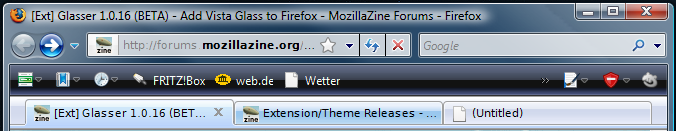
sauronreaver wrote:Does anyone know what extension highlights the domain name in this screenie?
It is locationbar². You'll have to use nighty tester tools or sth like it to get ff3 to install it though.
http://en.design-noir.de/mozilla/locationbar2/
@penguin22:
i know that buttons are a bit bigger but that was wanted. I like the height of the ff urlbar so i left it as it is and adjusted the buttons accordingly.
Concerning the radiance of the dropdown arrow - i took that from IE7 since i liked it better. I tried the other one first but it looks much worse imho.
As for lining things up .. i don't use the search bar at all myself seeing as keyword searches are way faster than using the searchbar itself. ff developers are actually thinking about removing it alltogether and integrating it with the urlbar. I'm sure it would be very easy though.. you just have to set the search bar to the right width and fiddle with a few margins and all should be good.
to make the searchbar have the same width you gotta do:
Code: Select all
#search-container {

  -moz-box-flex: 0 !important;
  max-width: 250px !important;

}
Last edited by Kupfel on May 21st, 2008, 4:48 am, edited 1 time in total.
-
sauronreaver
- Posts: 6
- Joined: April 26th, 2008, 1:08 am
Kupfel wrote:sauronreaver wrote:Does anyone know what extension highlights the domain name in this screenie?
It is locationbar². You'll have to use nighty tester tools or sth like it to get ff3 to install it though.
http://en.design-noir.de/mozilla/locationbar2/
Thanks for the swift reply, greatly appreciated. Also thanks for sharing your style sheet.
Cheers
-
Kupfel
- Posts: 416
- Joined: December 18th, 2005, 10:03 pm
@penguin22:
there you go .. small version with explorer size bar and buttons:
http://userstyles.org/styles/7399

also posted a style for IE7 styled tabs which i believe go well with the vista style:
http://userstyles.org/styles/7400

there you go .. small version with explorer size bar and buttons:
http://userstyles.org/styles/7399
also posted a style for IE7 styled tabs which i believe go well with the vista style:
http://userstyles.org/styles/7400
-
penguin22
- Posts: 4
- Joined: March 18th, 2005, 9:42 am
- Location: New Jersey
- Contact:
@Kupfel
Thanks for the updated style. I have posted a Tweaked version:
http://userstyles.org/styles/7404
This has the alignment adjustments for the top margin and bottom padding as well as the right margin alignment as I mentioned in my first post.
I'm not sure if you missed it, but the URL bar in your small version does not resize although the Search bar, Reload and stop do. I also resized that to the same 24px.
I looks great! Thanks again!
-
penguin22
- Posts: 4
- Joined: March 18th, 2005, 9:42 am
- Location: New Jersey
- Contact:
I thought I tried it by itself without the other styles enabled, but perhaps I still had the Vista themed style enabled after all. I am using the combination of the Vista Explorer bar style, the tweaked version of your small style and your tab bar style all together and they look great!
I did notice that depending on which style you mark active last, if there are explicit instructions to resize, etc. they take precedence over the same setting set in the style selected first.
Now I'm also looking forward to the New Tab Button on Tab Bar addon to become available for FF3 and hope that your style will apply to it by default when it does.
Also, for 6XGate or anyone that knows, is it possible to have the themed colored bars gradient like that in Windows Explorer? I only noticed that it is when working on the alignment and switching between Firefox and Windows Explorer.
-
Kupfel
- Posts: 416
- Joined: December 18th, 2005, 10:03 pm
ok. two complete themes. Now I'm done hijacking this thread 
http://userstyles.org/styles/7407

http://userstyles.org/styles/7406
http://userstyles.org/styles/7407
http://userstyles.org/styles/7406
-
ccMatrix
- Posts: 30
- Joined: March 5th, 2008, 1:45 pm
Kupfel wrote:ok. two complete themes. Now I'm done hijacking this thread
http://userstyles.org/styles/7407
http://userstyles.org/styles/7406
They could both use white dropdown markers