CSS rendering defect issues (compared to Edge/Chrome)

Discussion of bugs in Mozilla Firefox
Post Reply
DSperber
Posts: 155
Joined: September 30th, 2012, 1:52 pm

CSS rendering defect issues (compared to Edge/Chrome)

Post by DSperber »

Recently the AVSForum has converted from vBulletin to Xenforo, and the repercussions have not yet stopped. Everybody is hit with the dramatic differences in appearance (with both the forum-provided new LIGHT and DARK themes). And many have taken to implementing their own CSS style solutions as their own individual way to compensate, and produce what they really want to see vs. what the base forum presentation now looks like.

I myself am part of that crowd who's implemented presentation changes through Stylus extension In Firefox, and through Stylebot extension in Edge. And there is 99% duplicate results obtained using the two browsers, with the identical CSS code. However there are TWO particular presentation differences which I attribute to how the two browsers render, with Edge/Chrome doing it "clearly correctly" and Firefox presenting it "very obviously incorrectly".

I'm posting these two Firefox (vs. Edge/Chrome) defects here, in the hopes that the two issues will be recognized, acknowledged and hopefully corrected eventually if possible. I will document the two issues in two separate posts here, to avoid confusion.

I'm not a CSS programmer, but my intuition says that both problems deal with a similar root cause: (a) padding on the left side of a "box" around an "action button" has gotten dropped, and (b) padding on the top of a "box" around a complete forum article" has gotten dropped.

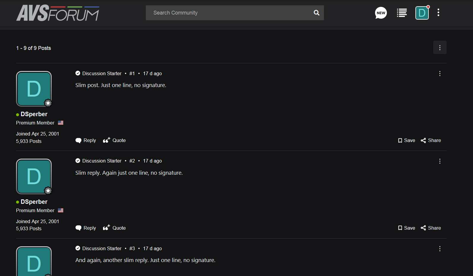
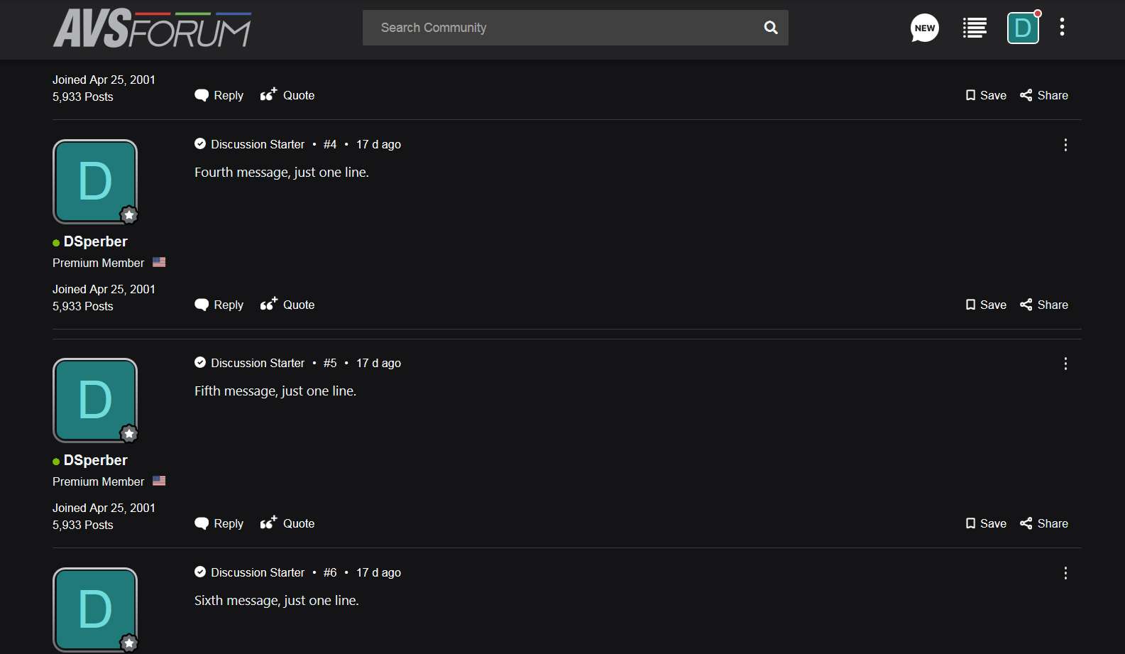
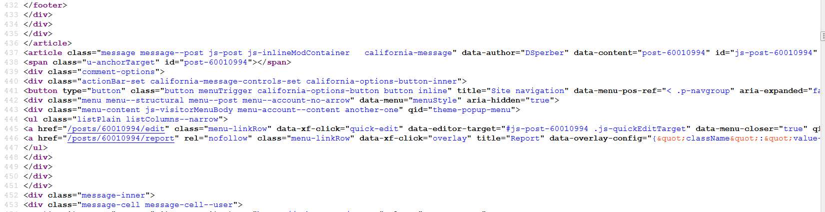
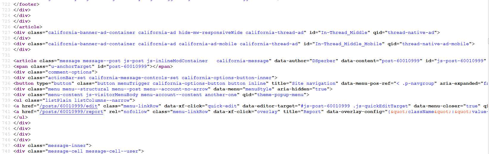
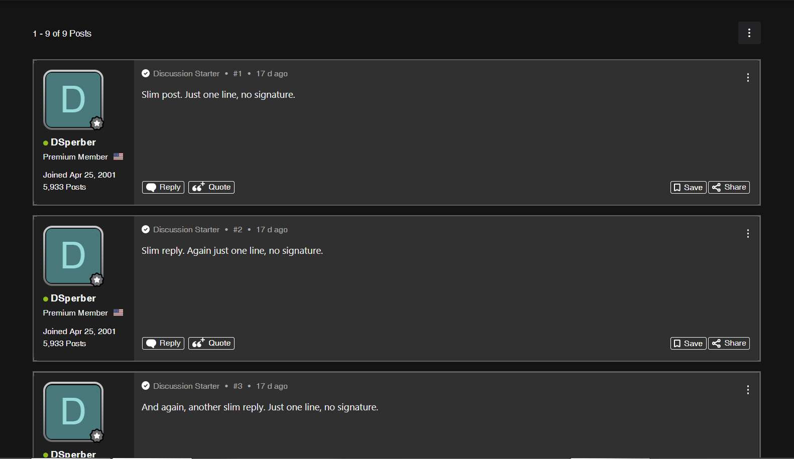
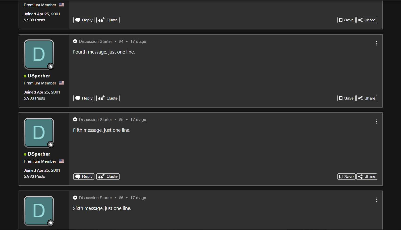
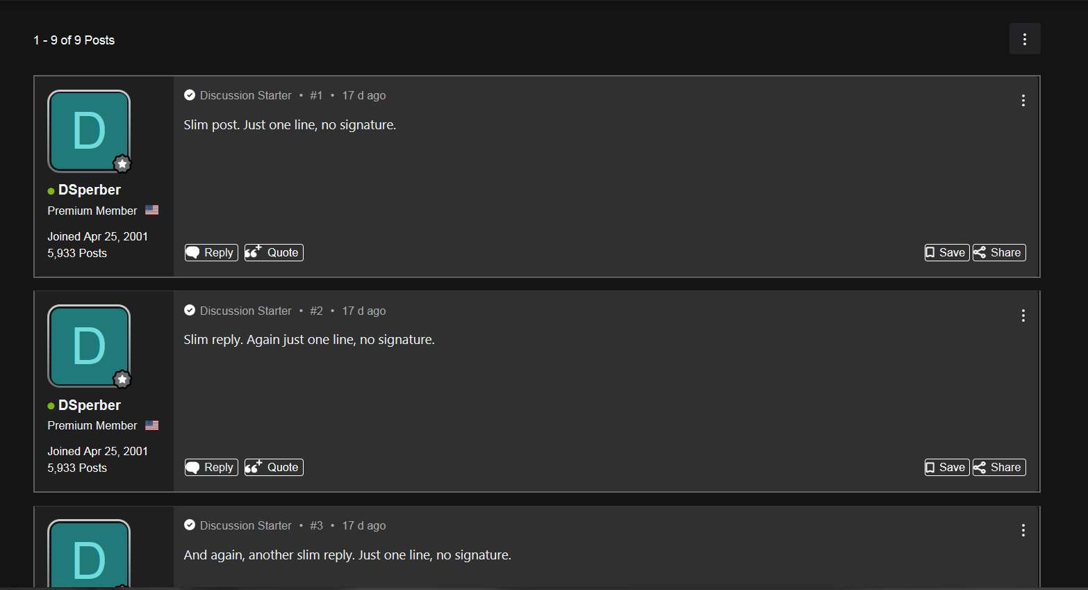
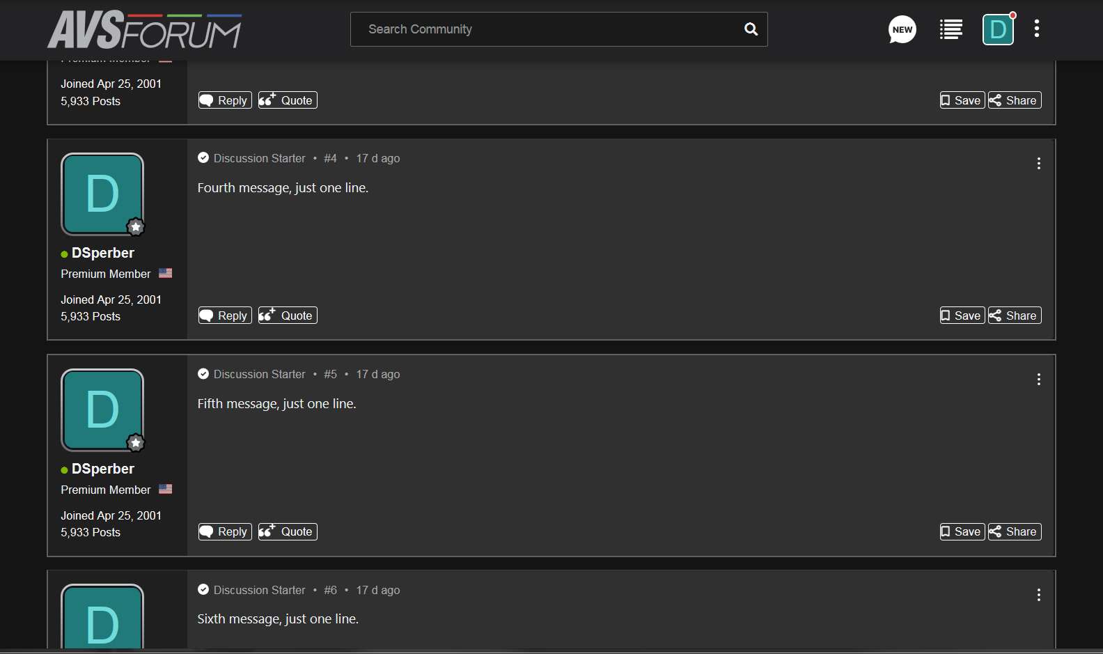
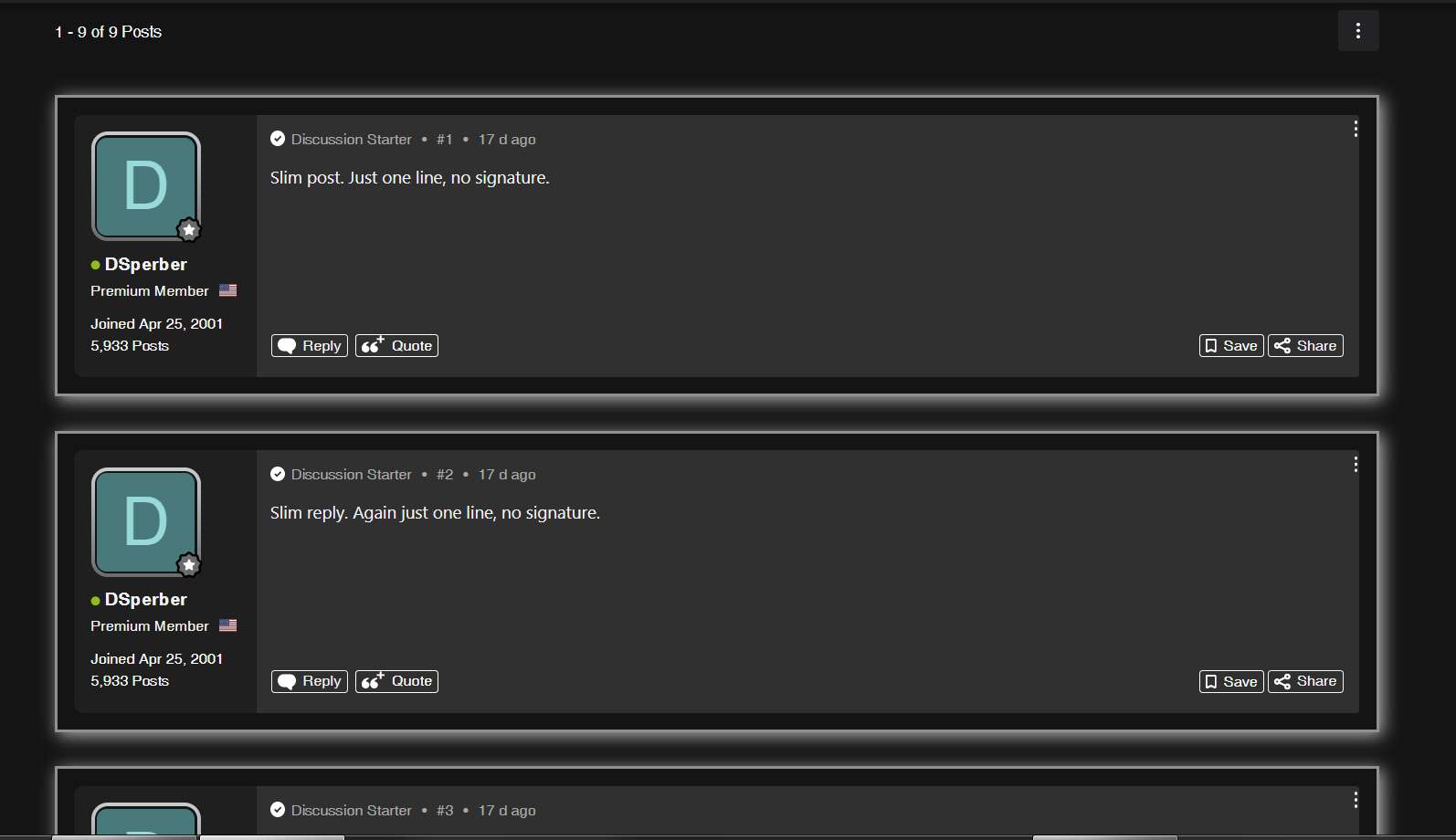
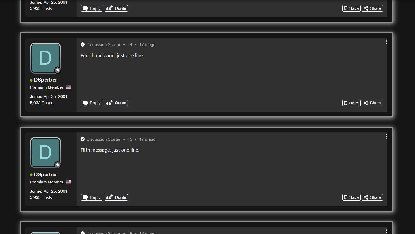
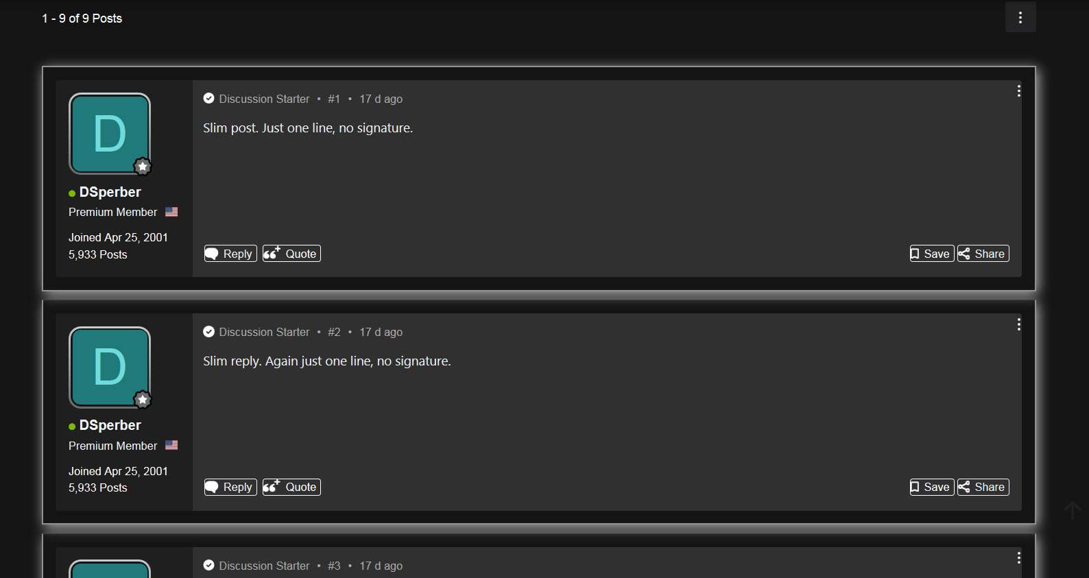
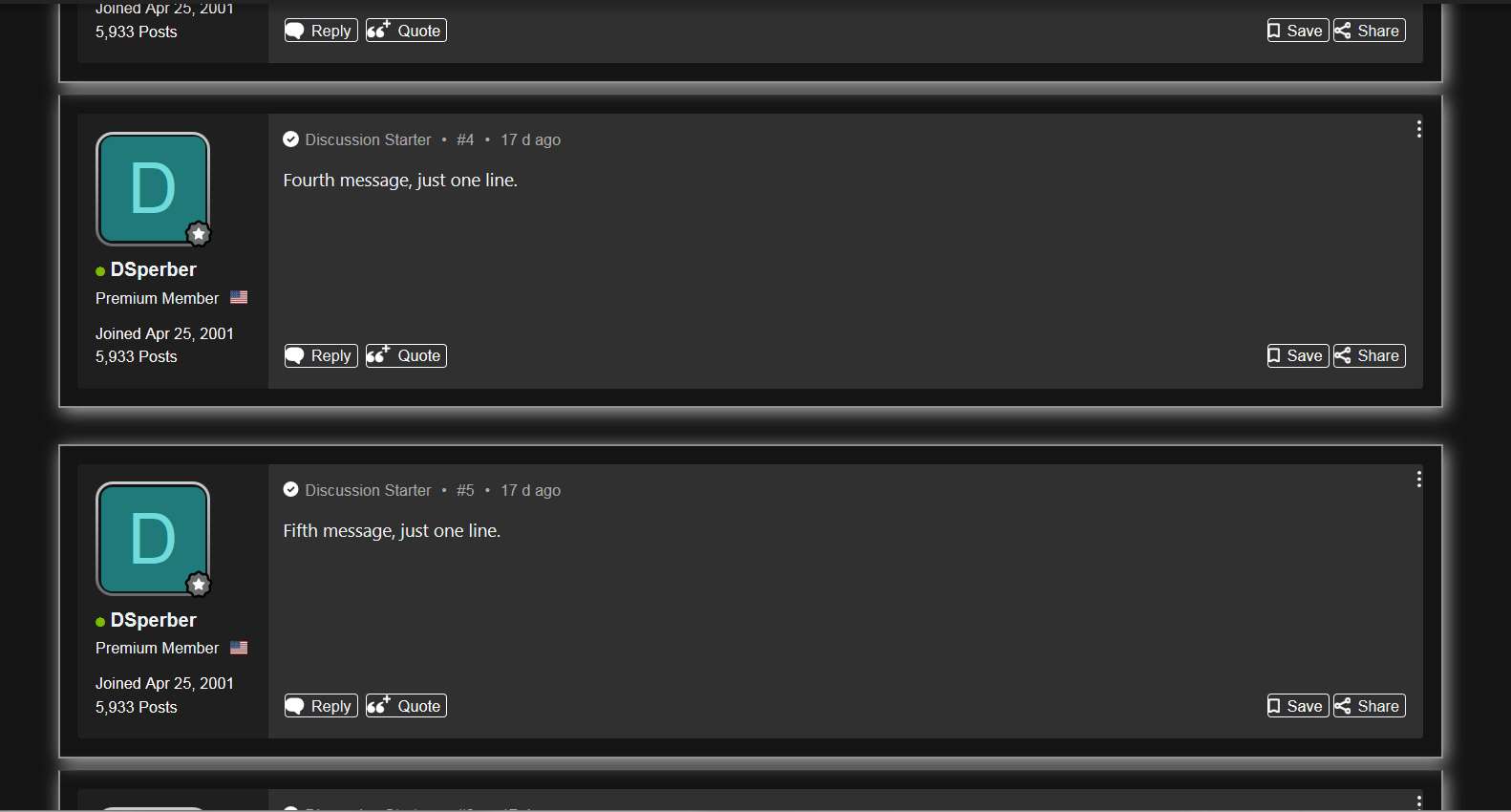
(1) There is a "button bar" at the bottom of each article with 4 or 5 buttons on it" REPLY, QUOTE, [LIKE], SAVE and SHARE. I believe the forum page source code that produces this code looks as follows. Note that if I were the the poster of the article the LIKE button is suppressed, so only 4 buttons would appear. But normally all 5 buttons are presented at the bottom of every article.

Code: Select all

<div class="message-actionBar actionBar">
<div class="actionBar-set actionBar-set--external">
<a href="/posts/60010993/bookmark" class="bookmarkLink actionBar-action button button--actionSet mobile-collapse  california-bookmark-button" title="" data-xf-click="bookmark-click" data-label=".js-bookmarkText" rel="nofollow" data-sk-bookmarked="addClass:is-bookmarked, Save" data-sk-bookmarkremoved="removeClass:is-bookmarked, Save" data-overlay-config="{"className":"value-to-follow-custom"}" qid="post-actionbar-bookmark"><span class="js-bookmarkText ">Save</span></a>
<a class="button actionBar-action california-share-button button button--actionSet mobile-collapse" data-xf-init="share-tooltip" data-href="/posts/60010993/share" title="Share" rel="nofollow" id="post-actionbar-share" qid="post-actionbar-share"><span>Share</span>
</a>
 </div>
<div class="actionBar-set actionBar-set--internal" qid="action-bar-section">
<a href="/threads/dsperbers-separator-test.3164414/reply?quote=60010993" rel="nofollow" class="button actionBar-action california-reply-button button--actionSet" title="Reply, quoting this message" data-xf-click="quote" data-quote-href="/posts/60010993/quote" data-overlay-config="{"className":"value-to-follow-custom"}" qid="post-actionbar-reply">Reply</a>
<a href="/threads/dsperbers-separator-test.3164414/reply?quote=60010993" rel="nofollow" class="button actionBar-action actionBar-action--mq u-jsOnly js-multiQuote button--actionSet" title="Toggle multi-quote" data-message-id="60010993" qid="post-actionbar-quote" data-mq-action="add">Quote</a>
<div class='california-like-button-wrapper' qid="post-actionbar-like-wrapper">
</div>
</div>
</div>
In its raw forum presentation (with no CSS alterations applied), this appears in both Firefox and Chrome identically, as follows:
Image

The following CSS code is applied to place a 4-sided "box" around each button, for visual highlighting. This is actually how the old vBulletin forum software used to present these five buttons, so the CSS code is really just putting things back the way they used to be which was visually appealing and clarifying.

There is supposed to be 5px of padding in the interior, around all four sides of the box (which would therefore be "centered" with space around it).

Code: Select all

.actionBar-set a {
  border: 0.5px solid;
  padding: 5px;
  margin-left: 1px;
  margin-right: 2px;  
  margin-top: 2px;  
  margin-bottom:2px;
}
And now the 4-sided box drawn around each button appears, but looks different in Firefox vs. Edge.

Note also that the actual length of certainly the first box (REPLY) is greater in Edge than in Firefox. Interesting, even if not relevant. Hard to tell if the other boxes are also not as long, but that first box definitely is larger with Edge. I think all boxes are "shorter" in Firefox because that leading 5px of padding is simply missing in each box.

(a) With Edge the spacing around the text inside the box looks perfect, with the text seemingly "centered" inside the box.
Image

(b) With Firefox the text is seemingly left-flush to the left edge of the box, apparently with zero padding only on the left side. The text is certainly not "centered" left/right as intended although it does appear centered vertically top/bottom.
Image


So, is this "fixable"?? Obviously not critical, but definitely not right.
User avatar
mightyglydd
Posts: 9813
Joined: November 4th, 2006, 7:07 pm
Location: Hollywood Ca.

Re: CSS rendering defect issues (compared to Edge/Chrome)

Post by mightyglydd »

This isn't a Firefox bug.
Don't Stylus have a forum...
#KeepFightingMichael and Alex.
DSperber
Posts: 155
Joined: September 30th, 2012, 1:52 pm

Re: CSS rendering defect issues (compared to Edge/Chrome)

Post by DSperber »

(2) The second defect issue concerns the vertical inter-article spacing, which is incorrectly rendered. Depending on the type of presentation chosen for this inter-article separation the issue may be essentially invisible, or very visibly apparent.

It is also important to point out that the AVSForum forum software inserts an extra "banner ad" strip every four articles. This banner ad can be eliminated by ad blocker extensions, or for "premium forum members" (such as myself) these ads are automatically suppressed. But the "article separator" where the banner ad would have gone is actually sent out.

In other words, for three out of every four articles there is only one article "separator line". And every fourth article there is an extra "separator line", so TWO lines appear in the forum default presentation. It's very easy to see this using the forum's "dark theme" (which I myself use). Note that this is identically presented in both Firefox and Edge, when using the Xenforo presentation with no CSS style alteration.

Here is the start of a thread, beginning with message #1 and going through the top message #3. Note there is a fairly faint single dividing line at the top of #1, and then there is a single dividing line between each message #2 and #3.

Image

And here is the next sequence of posts, starting from the bottom of #3 through the top of #6. Note that there is a DOUBLE DIVIDING LINE between #4 and #5 which is typical of the suppressed banner ad every four articles. This double dividing line will reappear again between #8 and #9, etc., etc. Every fourth post there is a double dividing line, with single dividing lines for the other three out of four arcicles in each group of four.

Image

Here is a screenshot of the underlying forum page source for the SINGLE LINE SEPARATOR at the bottom of every 3-out-of-4 articles. This particular code sample is the single line separator at the bottom of #1 (following /footer and then /article) and in front of the start of #2 (which is post-60010994):

Image

And here is a screenshot of the forum page source for the DOUBLE LINE SEPARATOR between every 4th article. This particular code sample shows the "banner ad" responsible for that extra dividing line, which appears in front of the normal single dividing line, hence why TWO lines appear every four articles:

Image

I will continue documenting the CSS differences between Firefox and Edge in the next post.
DSperber
Posts: 155
Joined: September 30th, 2012, 1:52 pm

Re: CSS rendering defect issues (compared to Edge/Chrome)

Post by DSperber »

mightyglydd wrote:This isn't a Firefox bug.
Don't Stylus have a forum...
Am I incorrect in believing that Stylus simply passed its modified style scripts to Firefox for rendering?

And as such, as long as the CSS sent to Firefox is as designed, wouldn't the failure to render it correctly be considered a Firefox bug? If the rendering of this exact same CSS element by Edge is "perfect", does that not point to Firefox as the culprit and not Stylus?

Yes, Stylebot is handling the CSS element for Edge but is once again just passing on the new code for Edge to render. And it's being done properly by Edge.

Is that not a Firefox issue? Am I wrong?
DSperber
Posts: 155
Joined: September 30th, 2012, 1:52 pm

Re: CSS rendering defect issues (compared to Edge/Chrome)

Post by DSperber »

Continuing on with the sample output for problem (2)...

The first attempt at separating articles more dramatically involves drawing a box around the entire article (i.e. "california-message"). This is implemented as a 2px border, color 606060 (light gray).

Code: Select all

.california-message {
  margin-top:15px;
  margin-bottom:15px;
  border: 2px solid #606060;
  padding-right:1px;
}
This works perfectly in Edge, and produces perfect 4-sided boxes around EVERY ARTICLE in a thread, no matter first or last, or 3-out-of-4 or every 4th. In other words the rendering of an article always produces the expected 4-sided box around the article.

Here is the CSS output rendered by Edge, for the first posts of the thread #1 - #3. Note that each article is properly surrounded by a 4-sided box rendered perfectly on all four edges.

Image

Here is the next set of posts again by Edge, for posts from the bottom of #3 to the top of #6. Again, proper 4-sided boxes around EVERY ARTICLE.

Image


In contrast, here is the same CSS output rendered by Firefox. Note that the first box around article #1 is correct, but then the TOP OF EACH BOX for subsequent articles #2 and #3 is mis-drawn. Something about the vertical space between them (represented by that single dividing line in the original page source) is causing a problem.

Image

And, here is the bottom of #3 to the top of #6. Note that the DOUBLE LINE SEPARATOR between #4 and #5 causes the correct drawing of the 4-sided box message #5. So unlike with every other 3-out-of-4 boxes where the top edge of the box is mal-drawn, for every fourth box which is preceded by that double dividing line the top edge of that box is now drawn correctly!! And this repeats exactly this way for each and every group of 4 articles (e.g. it will show up the same way for message #9, #13, etc.).

Image


Note that it doesn't matter how large the padding is specified in the CSS element. The top edge of 3-out-of-4 boxes is always mis-drawn, as if the padding for that top edge is simply ignored. The top edge gray border line is only visible in every 4th box, no matter what the padding px size number is.

And just to remind... this CSS element works perfectly in Edge. EVERY BOX IS PERFECTLY DRAWN AROUND EVERY ARTICLE, no matter which article. But with Firefox, only every 4th box (following the double divider line, which corresponds to the banner ad inserted every 4th article) is drawn correctly on all four sides. For 3-out-of-4 boxes the top edge of the box is simply mis-drawn no matter what the padding size value is specified as.
DSperber
Posts: 155
Joined: September 30th, 2012, 1:52 pm

Re: CSS rendering defect issues (compared to Edge/Chrome)

Post by DSperber »

One more demonstration of the Firefox rendering problem for 3-out-of-4 boxes following single line separators while the 4th box (following the banner ad double-line separators sent out every 4th article).

This time it's VERY EASY to see since there is a box shadow added around each article.

Code: Select all

.california-message {
    margin-top:30px;
  margin-bottom:10px;
  border: 2px solid #909090;
  padding:15px;
  box-shadow: 3px 3px 15px rgb(182, 179, 179);
}


And now here is what the first three boxes for #1 - #3 plus box shadow look like when drawn perfectly by Edge:

Image

And here is Edge for bottom of #3 to top of #6:

Image

In contrast, here is the DEFECTIVE FIREFOX, for #1 - #3. Note that there is essentially no separation for 3-out-of-4 boxes. The box-shadow effect improperly occupies all of that space:

Image

And here is bottom of #3 to top of #6 with Firefox, again defective except for between #4 and #5 where the double-line separator has somehow produced proper spacing between the boxes even with the box-shadow:

Image
Post Reply