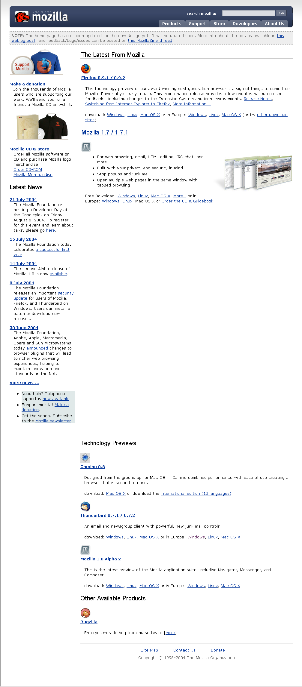
The team at <a href="http://www.silverorange.com">silverorange</a> has been working on a redesign of the mozilla.org website. We’re keeping most of the content as it is (especially historical content, like documentation, etc.). We have a new visual template and redesigned some of the key top-level pages. We call the new style <em>Cavendish</em>.
Please take a look through the site with your favourite web browser and post any issues/bugs on this MozillaZine thread. We’re most concerned about technical issues and bugs (rendering problems, etc.).
See the website beta now at <a href="http://website-beta.mozilla.org"><strong>website-beta.mozilla.org</strong></a></a>.
This is still a beta, so there are some outstanding issues. Some in particular that we’re aware of (so don’t bother pointing them out):
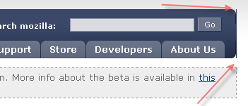
<ul><li>The home page has not been updated yet (except for the template, of course)</li><li>Round box corners not appearing in Internet Explorer (this is a known and accepted issue, we’re using :before and :after pseudo-elements, which aren’t supported in IE, but degrade gracefully)</li><li>The main logo/wordmark shows sporadically in IE5</li><li>Some extra margins in left menus in IE5/5.5</li><li>Main site tabs to not indicate current section</li><li>Mozilla Store is not included in the template</li></ul>
Aesthetic feedback is welcome, but we reserve the right to respectfully ignore it. We have no illusions of being able to please everyone. Rather, we’re aiming for a clean, simple, and professional overall look and feel.
New Mozilla.org Website Beta
-
sgarrity

- Posts: 102
- Joined: March 2nd, 2003, 10:42 am
- Contact:
-
andy2kuk
- Posts: 149
- Joined: May 29th, 2003, 4:21 am
Feedback:
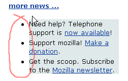
- News & Shop needs to be moved off the front page. The front page should be about getting people to download the products, not getting them to donate etc.
- It is my belief that the main content area of the web page should be a short text about each product, along with the icon and a link to the product page. (The mozilla section on that page is the best one) The product page should heavily 'sell' the product, as well as giving download links and further information (extensions, themes, etc.)
- Many areas of the site that people will want to visit are not clearly visible. Say I wanted to look at the extensions that I heard so much about. Where would I click? There should be a sidebar in place of the current donate/store/news sidebar which give links to things like extensions, themes, end-user support.
I must say that the aesthetic portion is nice, although it could do with more structure in the content area. I think a vertical bar in between the sidebar and content area would improve things a lot.
-
doron
- Posts: 935
- Joined: November 4th, 2002, 4:50 pm
The left hand menu at http://website-beta.mozilla.org/developer/ is about 1/3 of the width on 1024x resolutions - it really should be less wide.
If you see a marquee, clap your hands!
-
sgarrity
- Posts: 102
- Joined: March 2nd, 2003, 10:42 am
- Contact:
-
dburka

- Posts: 3
- Joined: August 20th, 2004, 9:17 am
- Contact:
Doron: I've worked with Steven on this whole design. We got some similar feedback from a number of developers about the width of the left menu. We're trying a smaller percentage on the left column. It should be updated on the Beta in about 10 minutes as it's already committed to the CVS.
Daniel Burka, Mozilla Visual Identity Team Member
-
Foxtrot

- Posts: 509
- Joined: May 31st, 2004, 12:07 pm
- Location: Look up.
Thank you! 
At first, I was gonna lynch you because you hadn't done exactly what I told you to do. I would've made a complete fool out of myself (again) if I did, because I'd only seen the front page. This is great. You've made proper navigation, you've made CSS-based design, you've made a proper structure for the site... amazing!
It's still a beta, though, I can see that. First priority would be to make the front page up to stratch, following the style of the rest of the site. Right now it has advertisement that doesn't belong, it doesn't describe the Mozilla Foundation, and it gives crappy descriptions of the products.
My advice:
1) Remove the advertisement on the front page.
2) Move every product into a content div with a concise description of the product.
3) Change the task of the front page into describing the Mozilla Foundation and being a portal to the products, instead of trying to be everything and failing.
4) Make the site compatible with all browsers.
"In the beginning the Universe was created. This has made a lot of people very angry and has been widely regarded as a bad move." -Douglas Adams
-
bsmedberg
- Posts: 9
- Joined: June 25th, 2004, 6:55 am
- Location: Washington, DC
- Contact:
developer.mozilla.org
Knowing the devmo is coming along really soon now, can we have a navigation tab for developer information go there?
And what's with the dinasour? IMO there are too many icons hanging around, with the firefox world, tbird bluebird, Mozilla "M", and the weird old red dinasour.
Finally, is mozilla.org going to link to NVU? It's a really cool mozilla-based project.
And what's with the dinasour? IMO there are too many icons hanging around, with the firefox world, tbird bluebird, Mozilla "M", and the weird old red dinasour.
Finally, is mozilla.org going to link to NVU? It's a really cool mozilla-based project.
-
rj_keller
- Posts: 12
- Joined: January 3rd, 2004, 7:09 pm
- Contact:
Re: New Mozilla.org Website Beta
This looks pretty bad: http://website-beta.mozilla.org/project ... /index.php
The border problem is my fault, but the top part shouldn't be a different color.
The border problem is my fault, but the top part shouldn't be a different color.
-
dburka
- Posts: 3
- Joined: August 20th, 2004, 9:17 am
- Contact:
-
andy2kuk
- Posts: 149
- Joined: May 29th, 2003, 4:21 am
-
chengkhoon
- Posts: 67
- Joined: August 9th, 2003, 8:40 am
- Location: Malaysia
- Contact:
Suggestions (in random order):
1. For specific product pages, the features listed should include screenshots which popups when clicked.
2. Even better still, clicking on the screenshots gives an introduction to the specific feature (can be a short Flash introductory).
3. Headings should stand out (a different color).
4. The right column is better off with a different typeface (perhaps a different color) to distinguish from the left column.
5. The footers can be of a smaller fontsize and the line-height can be reduced.
6. Below the 'Featured Mozilla Projects' section, a small link 'Other Projects' won't hurt.
7. Hovered tabs could be of a lighter color. (because I found it hard to distinguish)
8. Isn't Firefox's official tagline 'Take Back the Web'?
That's all I can think of right now. Other than that, great job! The layout is cleaner and the navigation is clearer! Kudos to the silverorange team!
-
richwklein
- Posts: 331
- Joined: November 24th, 2002, 8:20 pm
- Location: Iowa
- Contact:
I like the look so far. It looks like the get source, and build tools pages are shifted to the right slightly.
Edit: it also looks like /projects/firefox/qa is shifted as well.
Edit: it also looks like /projects/firefox/qa is shifted as well.
Last edited by richwklein on August 20th, 2004, 12:30 pm, edited 1 time in total.
My Extensions:
<a href="http://forecastfox.mozdev.org">Forecastfox</a>
<a href="http://tipbar.mozdev.org">Tip of the Day</a>
<a href="http://urlnav.mozdev.org">Location Navigator</a>
<a href="http://finder.mozdev.org">Finder</a>
<a href="http://rsszilla.mozdev.org">RSSzilla</a>
<a href="http://forecastfox.mozdev.org">Forecastfox</a>
<a href="http://tipbar.mozdev.org">Tip of the Day</a>
<a href="http://urlnav.mozdev.org">Location Navigator</a>
<a href="http://finder.mozdev.org">Finder</a>
<a href="http://rsszilla.mozdev.org">RSSzilla</a>
-
MXN

- Posts: 92
- Joined: November 5th, 2002, 7:28 pm
- Location: Stanford, California, United States
- Contact:
- The product pages for Firefox, Thunderbird, etc. could have at least a thumbnail of a screenshot on there. Or even a link to a page of screenshots, because visitors might be reluctant to download software they can't see "in action."
- The link to the Sunbird project page currently points to http://website-beta.mozilla.org/products/projects/calendar/sunbird.html. It should point to http://website-beta.mozilla.org/projects/calendar/sunbird.html.
- The Camino product page is missing the stylesheet right now.
Edit: Corrected the URL that the Sunbird link should go to.
Last edited by MXN on August 20th, 2004, 12:26 pm, edited 2 times in total.
-
dburka
- Posts: 3
- Joined: August 20th, 2004, 9:17 am
- Contact:
-
Flexer
- Posts: 149
- Joined: September 25th, 2003, 6:19 am
- Location: Bulgaria
- Contact:
IE6 SP2
Olso there is a big gap betwean 'Mozilla 1.7 / 1.7.1' section and 'Technology Previews' you can see a screenshot here: http://www.cutephp.com/images/other/whole.png
Olso there is a big gap betwean 'Mozilla 1.7 / 1.7.1' section and 'Technology Previews' you can see a screenshot here: http://www.cutephp.com/images/other/whole.png